Designing a productive and inviting home office starts with selecting the perfect paint colors. The ideal palette can transform a workspace into an oasis of creativity and focus. Finding the best paint colors for home office involves a blend of personal style, functionality, and psychological impact.
Whether aiming for a serene, calming atmosphere or an energizing, motivational vibe, the colors adorning your office walls can significantly influence productivity and mood. From calming neutrals to vibrant hues, navigating the myriad of options to find the perfect shades tailored to your preferences and work requirements is key to curating an inspiring and conducive home office environment.
How to Pick a Home Office Paint Color
As remote work becomes increasingly prevalent, individuals craft personal workplaces with careful intent, ensuring that design choices foster both focus and creativity.
Selecting the right paint color for a home office interior design emerges as a crucial decision, one which reflects personal aesthetics while also potentially impacting one’s mindset throughout the workday.

Confronted with an array of hues, individuals must navigate their freedom of design, acknowledge the psychological effects colors have on mood and productivity, and embrace the journey of color swatching to pinpoint that perfect ambient backdrop, setting the stage for a haven of both efficiency and inspiration.
Freedom of Design: Tailoring Your Home Office
The intersection of personal taste with functional design manifests vividly in the selection of a home office’s color scheme. It represents not just an aesthetic choice, but a deliberate crafting of the environment: one where every shade can serve to catalyze focus, encourage calm, or spark creativity.
Consider how natural light interacts with different tones, influencing the room’s ambiance at various times of the day.
Analyze the psychological impact of colors, selecting those that align with your work temperament and goals.
Foresee the office’s flexibility for multi-use scenarios, opting for colors that can adapt to varying needs and moods.
Indulging in the autonomy of design, professionals have the unique opportunity to curate a space that not only reflects their identity but also orchestrates thoughtful productivity. This choice goes beyond mere decoration; it’s an investment into one’s daily working experience and, by extension, their professional output.
Prioritizing Productivity: Impact of Colors on Your Mood
Selecting the optimal shade for a home office transcends aesthetic appeal, as it wields the power to influence psychological state and stimulate productivity. Vibrant colors might infuse energy and drive, while softer tones could contribute to focus and emotional balance.
A discerning professional recognizes the necessity to ensure the color palette aligns with their work style, perhaps opting for blues and greens to foster concentration or warmer tones to elevate creativity and warmth. This decision is a calculated element in constructing an environment conducive to high-level performance.
Color Swatching: Personalized Selection for the Ideal Shade
Embarking on color swatching, one encounters a hands-on method to discern the nuances between shades and determine which truly resonates with the spirit of their work sanctuary. It entails applying small patches of different paints on the walls and observing how each reacts under various lighting conditions and against office furnishings to ensure the selection complements every component of the room.
Through this rigorous but enlightening process, nuances emerge that may evade initial consideration: a slight undertone in the morning glow or compatibility with technological devices and accessories that makes a particular shade an unequivocal match. Such meticulous attention to detail culminates in the discovery of an ideal hue that not only appeals to the eyes but also fits seamlessly into the daily workflow.
Productivity and Color Psychology
The interplay between color and psychology is a significant aspect of home interiors, where the right chromatic environment can dramatically affect emotional state and cognitive abilities.
As individuals decipher the spectrum of colors to paint their home offices, it becomes essential to explore the scope of emotional influence these choices carry.
From the soothing reassurance found in a palette of blues to the revitalizing energy of playful hues, each color possesses an inherent capacity to modulate mood and endorse specific mindsets conducive to productivity.
Acknowledging the psychological heft of color choices is indispensable for crafting a space that not only satisfies aesthetic desires but also fortifies mental focus and professional efficiency.
Understanding Color Impact: Mood and Emotional Influence
The significance of color in shaping emotional responses is deeply rooted in psychological principles. An adept selection of hues can serve as a silent partner, maneuvering the emotional ebbs and flows that daily tasks demand.
A tranquil shade of blue may foster a sense of serenity, steadying nerves ahead of crucial decisions.
In contrast, a dynamic red could inject a surge of vigor, beneficial when tackling complex problems.
Meanwhile, earthy greens often bridge the gap, instilling a balance that can enhance both innovation and methodical thinking.
Understanding the interplay between color and mood equips professionals to craft interiors that do more than please the eye: these spaces actively engage with their occupants, stimulating desired emotional reactions and nurturing peak professional performance.
Popular Color Palettes: Blues, Greens, Neutrals, and Playful Colors
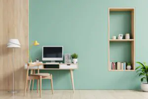
In the realm of home office customizations, the choice of color palette is a testament to one’s understanding of the subtleties of productivity and well-being. Blues, lauded for their calming effect, are popular among professionals seeking a serene environment, while greens are often selected for their association with nature, evoking tranquility and open-mindedness.
Meanwhile, neutrals afford an understated elegance, offering a backdrop of minimalist sophistication that eliminates visual distractions, thereby enhancing concentration. Playful colors, though less conventional, can introduce a vibrant dynamism into the space, stimulating creativity and breaking the monotony of routine tasks.
Similar Post: Home Staging Tip: Best Paint Colors To Sell Your Home
The Best Home Office Paint Colors
Navigating the nuances of chromatic choice for a home office goes beyond mere preference; it is a decision that carries a substantial impact on day-to-day professional life.
Colors cast a profound spell, with each hue capable of shaping emotional well-being and cognitive performance.
1. Light Sage imbues an aura of elevated calmness, while Plum Purple draws out a striking sophistication within four walls.
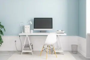
2. Light Blue merges serenity with a dash of vitality, as Pale Gray provides the consummate neutral canvas.
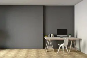
3. The commanding presence of Navy Blue brings depth and focus, whereas Olive Green weaves a tapestry of stately playfulness.
4. For a canvas of timeless adaptability, White stands unmatched.
5. Dusty Pink whispers subtle invigoration, and Teal offers a refreshing blend of flexibility and whimsy.
Rounding out the spectrum, Rose Pink evokes understated creativity, proving that each color offers a unique key to unlocking productivity and imagination in personal workspaces.
· Light Sage: Elevated and Relaxed
An ambiance of tranquility envelops the home office when graced by Light Sage, a hue that champions repose and mental clarity. The understated vibrancy of this color elevates the atmosphere, providing a canvas that fosters lucidity and peaceful reflection for strategic thought.
Employing Light Sage on the walls merges aesthetics with psychology, as its gentle green whispers restoration during periods of intense cognitive demand. Its presence acts subtly, promoting a relaxed mindset without sacrificing the sharp focus required for professional rigor.
· Plum Purple: Sophisticated and Striking
When the aim is to infuse a workspace with an essence of opulence and depth, Plum Purple stands as the distinguished choice. This deep, rich hue embodies a blend of luxury and ambition, imbuing the office with a bold statement that drives focus and reflects a seasoned sensibility.
The robust shade serves as a backdrop that energizes determination, guiding the vision of a professional navigating complex projects. Plum Purple’s regal presence fosters a space that doubles as a think tank, where innovation is both born and refined.
It’s not solely about the visual pleasure this vibrant color provides; the shade possesses an ability to command attention while promoting reflective introspection. In a sea of conventional choices, Plum Purple dares to challenge the norm, offering a sanctuary where creative thought prospers under its watchful hue.
· Light Blue: Serene and Energetic
Light Blue emerges as a shade that harmonizes the tranquil essence of the sky with the invigorating expanse of the ocean. This choice graces home offices with an atmosphere conducive to undisturbed thought coupled with an undercurrent of energetic possibility.
In spaces swathed with this airy hue, professionals discover a balance between the peace needed for concentration and the vitality required for sustained, innovative work. With its dual nature, becomes a catalyst in a realm where serenity underpins activity and drive.
· Pale Gray: Ideal Neutral Hue
In a world increasingly drawn to minimalist sophistication, Pale Gray asserts itself as an impeccable choice for the contemporary home office. This hue offers a tranquil canvas, free from visual clutter, enabling professionals to engage with their tasks with undivided attention and a calmer mind.
The subtle strength of Pale Gray lies in its versatile nature, simultaneously reflecting light to maximize the sense of space while providing a stable backdrop for bolder accents and artwork. It fosters an unobtrusive yet thoroughly modern atmosphere, ideal for sustained focus and productivity.
· Navy Blue: Powerful and Thoughtful
In the arena of home office design, Navy Blue emerges as a commanding force, instilling a sense of depth and focus. It anchors the space in profound sophistication, offering a backdrop that complements the cerebral demands of work-life.
1. It instills a grounding presence in the home office.
2. It complements cerebral demands, enhancing focus.
3. It conveys an aesthetic of undeniable professionalism.
This shade acts not only as a visually appealing accent but as a psychological stimulus, strengthening decisiveness and cognitive sharpness. Its thoughtful application brings forth an environment ripe for productivity, carved by a color that resonates with strength and contemplation.
· Olive Green: Regal and Playful
Olive Green stands as a color of complexity, exuding an air of dignity while offering a hint of playfulness to invigorate the home office space. It presents a rich tapestry that bridges the worlds of staid professionalism with a zest for innovation and out-of-the-box thinking.
Its depth characterizes a workspace imbued with maturity and wisdom. The subtle vibrancy invites a burst of creativity amidst the demands of daily tasks.
This hue murmurs of ancient libraries and the hallowed halls of thought while also echoing the refreshing feel of a woodland walk to clear one’s mind. The application of Olive Green in a home office underlines a commitment to both gravitas and rejuvenation in the professional sphere.
· White: Timeless and Versatile
The purity of White in a home office setting renders a design that surpasses the short-lived trends, offering a backdrop against which all other colors seamlessly stand out. It serves as a chameleon, adapting effortlessly to changing decor or moods, making it a prudent choice for a workspace that is meant to evolve with time.
Through its unassuming presence, a home office adorned in White can enhance the feeling of spaciousness, while minimizing distractions, allowing the professional at work to direct their full attention to the tasks at hand. This classic tone invites a clear-headed approach to professional endeavors, embodying both the simplicity of minimalism and the potential for limitless personalization.
· Dusty Pink: Subtle Energy
Embracing Dusty Pink within the confines of a home office imparts an echo of warmth, a whisper of energy without overwhelming the senses. Its soft presence is a subtle nod to vibrancy, a gentle stimulus within the professional sanctuary.
This color introduces a rejuvenating flourish to a room where analytical tasks often dominate. The carefully chosen vibrance facilitates the flow of thought, sustaining momentum through lengthy projects.
As an audacious alternative to traditional neutrals, Dusty Pink offers solace and a hint of optimism in spaces dedicated to task completion. It is a selection that delineates the foresight of a professional willing to infuse their workspace with an unconventional yet harmoniously energetic hue.
· Teal: Flexible and Fun
Gracing the walls of a home office, Teal operates as a multifaceted hue that straddles the line between a rejuvenating escape and a chic professional backdrop. The shade’s inherent flexibility allows it to cater to both intense focus sessions and moments of creative brainstorming, adapting to the shifting demands of work tasks without missing a beat.
Against the fluidity of Teal, one discovers a playful undertone that injects an element of enjoyment into the workday, transforming the workspace into a dynamic nucleus of energy and inspiration. It is a shade that impresses upon visitors and occupants alike a sense of fun that elevates the mood and enlivens the spirit, an essential quality for fostering a productive and pleasurable work environment.
· Rose Pink: Sophisticated and Creative
In the nuanced theater of room design, Rose Pink emerges as a hue of refined imagination, inviting a sophisticated yet creative atmosphere. Its gentle undertones foster an environment where innovative ideas and strategic thinking are nurtured among the subtleties of its warm embrace.
The choice of Rose Pink for a workspace states a bold intent: to merge the poise of advanced professionalism with the allure of artistic prowess. With its capacity to inspire and uplift, Rose Pink transforms the mundane into the extraordinary, setting the scene for a home office that thrives on both ingenuity and style.
Enhancing Productivity with the Right Home Office Paint Colors
In sum, the careful curation of color in a home office is crucial for promoting productivity and enjoyment in one’s workspace. By using color swatches as a strategic guide, individuals tailor their environment to not only reflect personal style but also to foster an atmosphere conducive to both focused work and creative thinking.
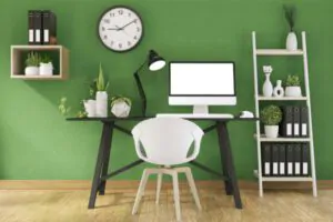
The psychological effects of color play a pivotal role in this, as they profoundly influence mood and cognitive function. Through an informed selection of hues, professionals can transform their work areas into vibrant hubs of efficiency and comfort, making the most out of their home offices for optimal performance and job satisfaction.
For more home office ideas, contact your trusted painter today!

